CASE STUDY
This project is a collaborative effort between me and 3 classmates who majored in psychology, marketing, and computer science. The idea for the project was initiated by Tactile, a product design, UX / UI design and mechanical engineering firm in Seattle. Once a week our teams would present our progress to Tactile via Zoom, and they would give us feedback to work on for the next week. For final presentations we presented to them in person at their building in Seattle.
Case Study: Aging In Place
Role: Graphic Designer, Researcher, UX Designer
Length of Project: 3 months
The Problem: 77% of adults over the age 50 want to remain at home and age in place. How can we assist aging in place and independence for the elderly in 2030 when all Baby Boomers (people born from 1946 to 1964) will be older than 65?
Project Overview: Create a product for the Boomer generation that would help them age in place in order to avoid assisted living and to be able to maintain their independence.
Project Goals:
- Finding support that fits their living at-home needs
- Addressing physical limitations as they age
- Managing physical and mental health at-home
Research and problem mapping
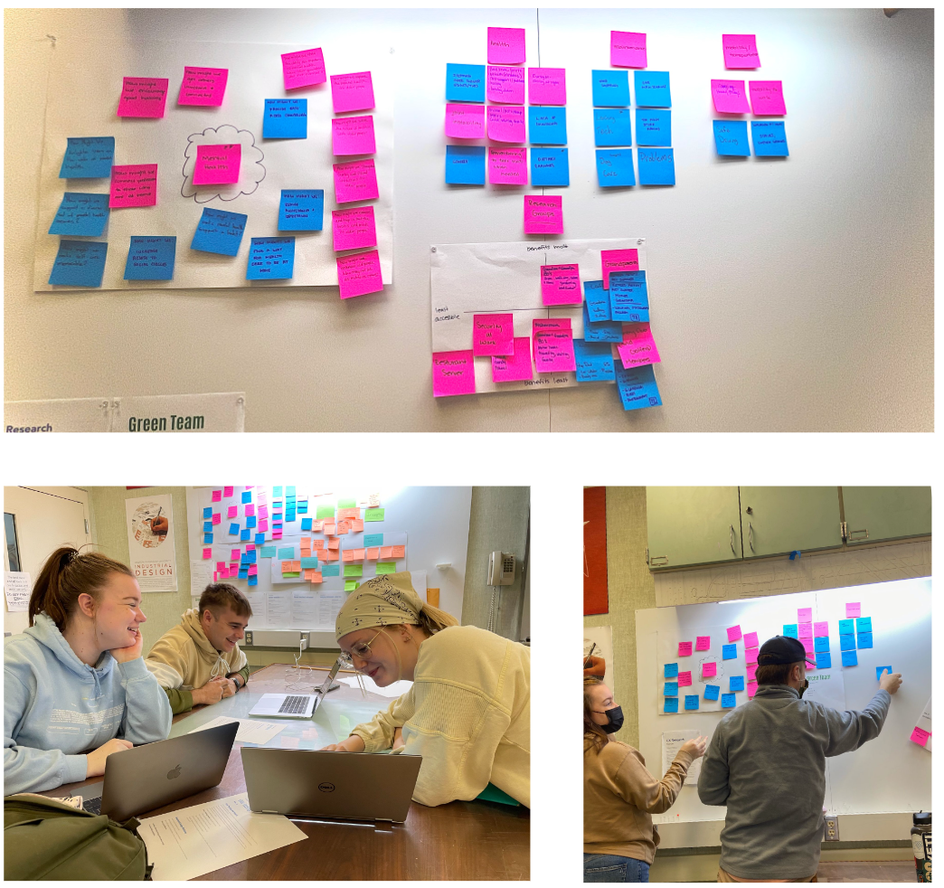
Our team conducted zoom interviews to members of our families in both the Boomer and Silent generations (people born from 1928 to 1945). Then we researched statistics about both generations in order to better understand our potential target audience. We wanted to gain insights about aging, what our users want and need, and find our problem space.
We found through our research that...
45% Of adults ages 85 and up have been diagnosed with depression and 20% Of adults ages 55 and up experience some form of mental health issue. We chose mental health as our problem space and decided that our solution would be focused on:
- An easy path towards healthcare
- Habit tracking
- Voice assisted systems
- Assistance with physical activity
- Easier access to family and loved ones
PROBLEM MAP
DESIGNED BY SETH DAETWILER, KOURTNEY ROBERTS, AND EMILLIE THEE
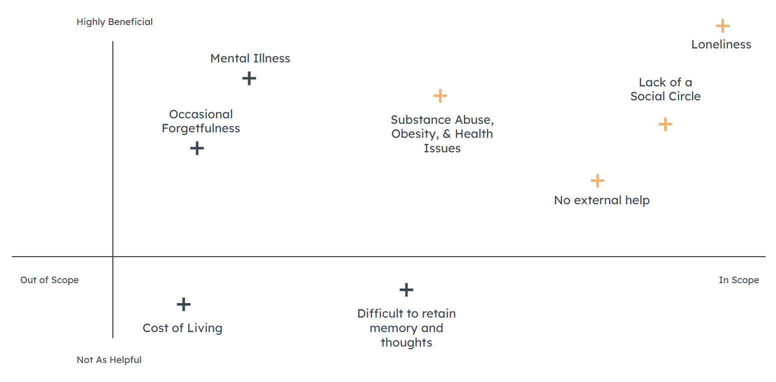
The orange topics are those we decided were most important and themes we wanted to focus on.
User Persona
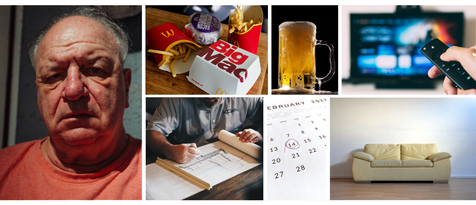
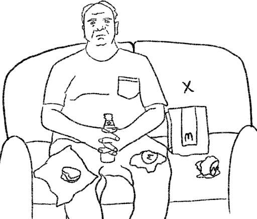
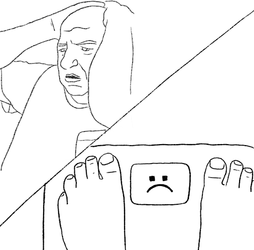
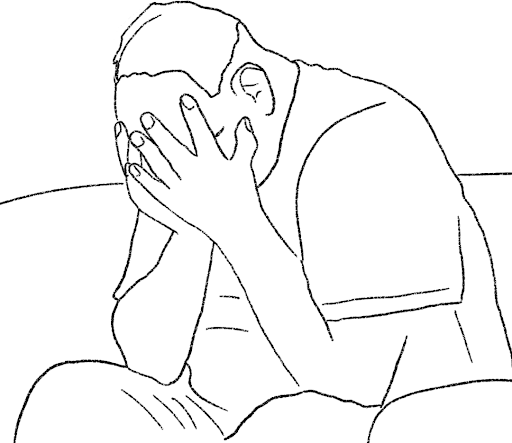
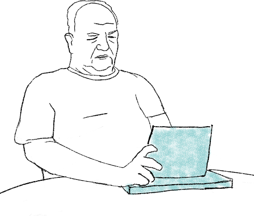
My team created User Persona Russell, a Retired Contractor from Tacoma, Washington. After retirement, he gained a substantial amount of weight and fell into bad habits as he has settled into a more sedentary lifestyle. His drinking has gotten out of hand, and because of his previous work environment he holds stigmas about mental health and does not hold it as a priority. He is stuck in a poor mental health loop as shown below in his user journey map, which would eventually lead to assisted living. His goals are to reduce his drinking, get active again, improve his memory, develop healthier habits, find a hobby, and spend more time with his children.
After creating Russell and his journey, we found that we were leaning too heavily into substance abuse and counseling; issues in which solutions already exist. We did not want to claim to be experts in these fields so we redirected towards the idea of creating and maintaining healthy habits to keep minds and bodies active while staying at home.
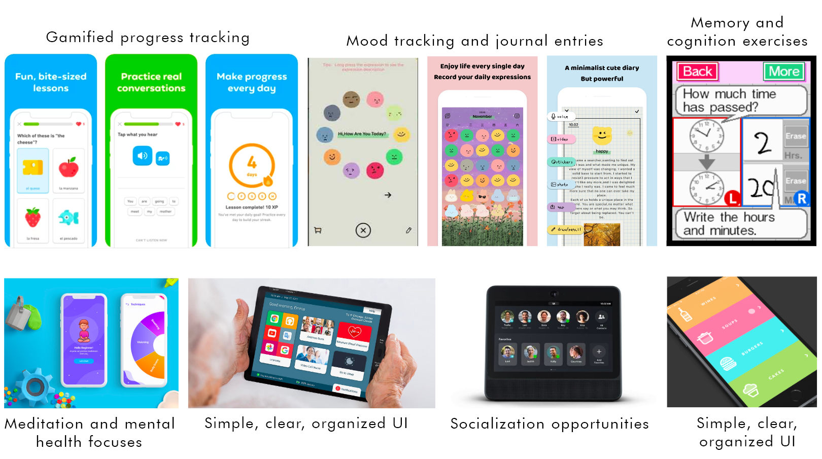
Digital Design Inspiration
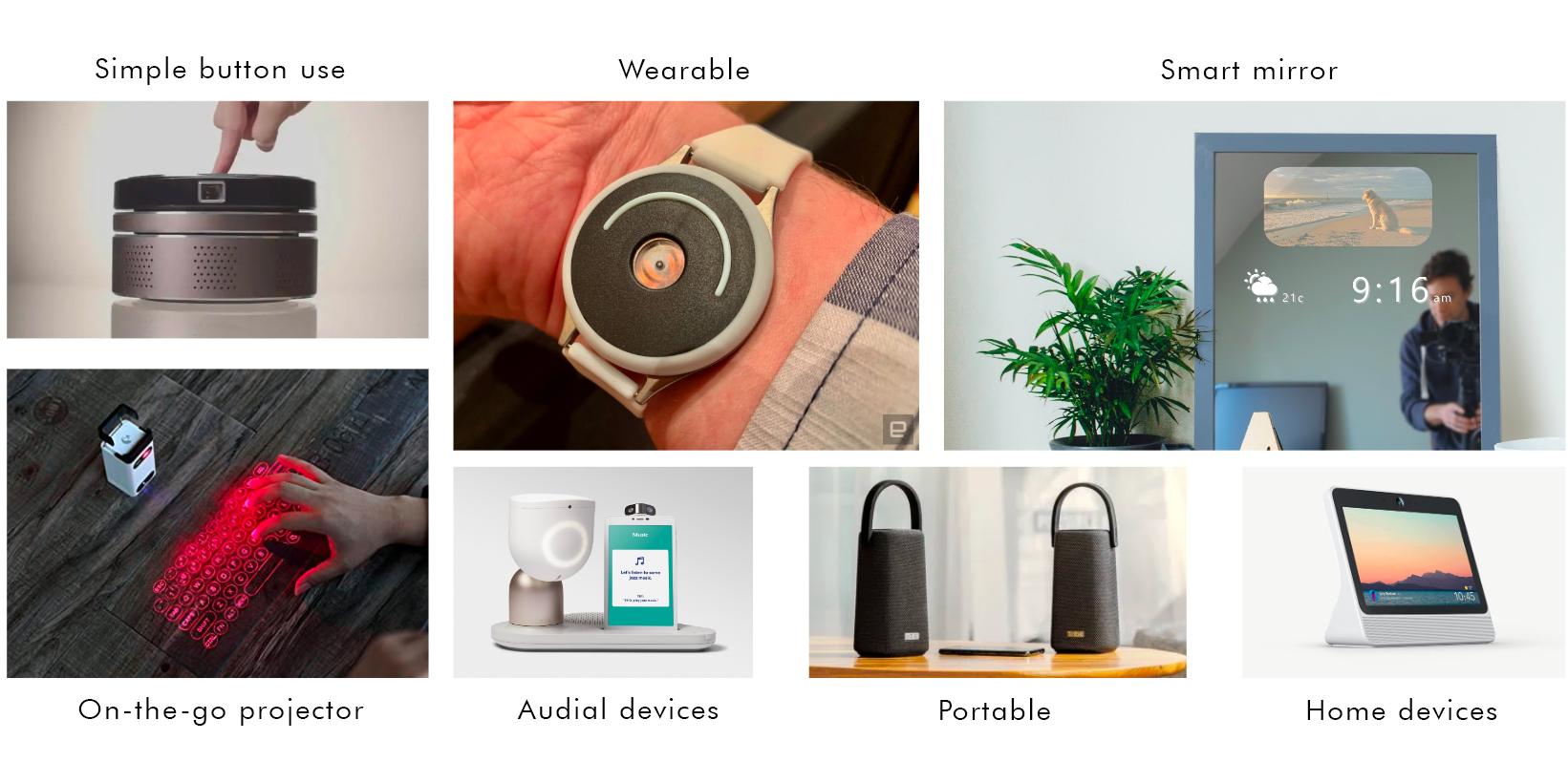
Hardware Design Inspiration
Ideation
My team and I explored different ideas to enforce healthy habits like home and on the go devices, touch screen and tangible navigations, cognition and body exercises, and socializing opportunities. Each idea had one thing in common; they would track your habits and mental health progress.
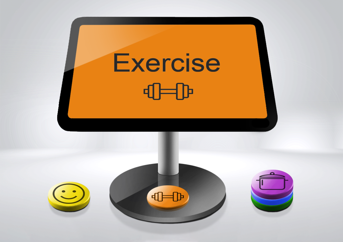
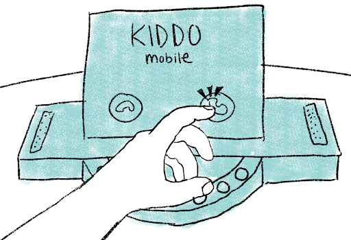
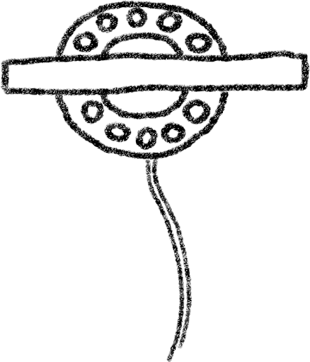
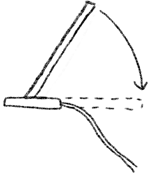
From these options, we decided on the NFC Tabs and Tablet device. We wanted something that integrated a more physical experience, which is something the Boomer generation was most used to. We decided the NFC portion would be placed in the hardware of the device to simulate page navigation similar to a rotary telephone.
Concept Refinement
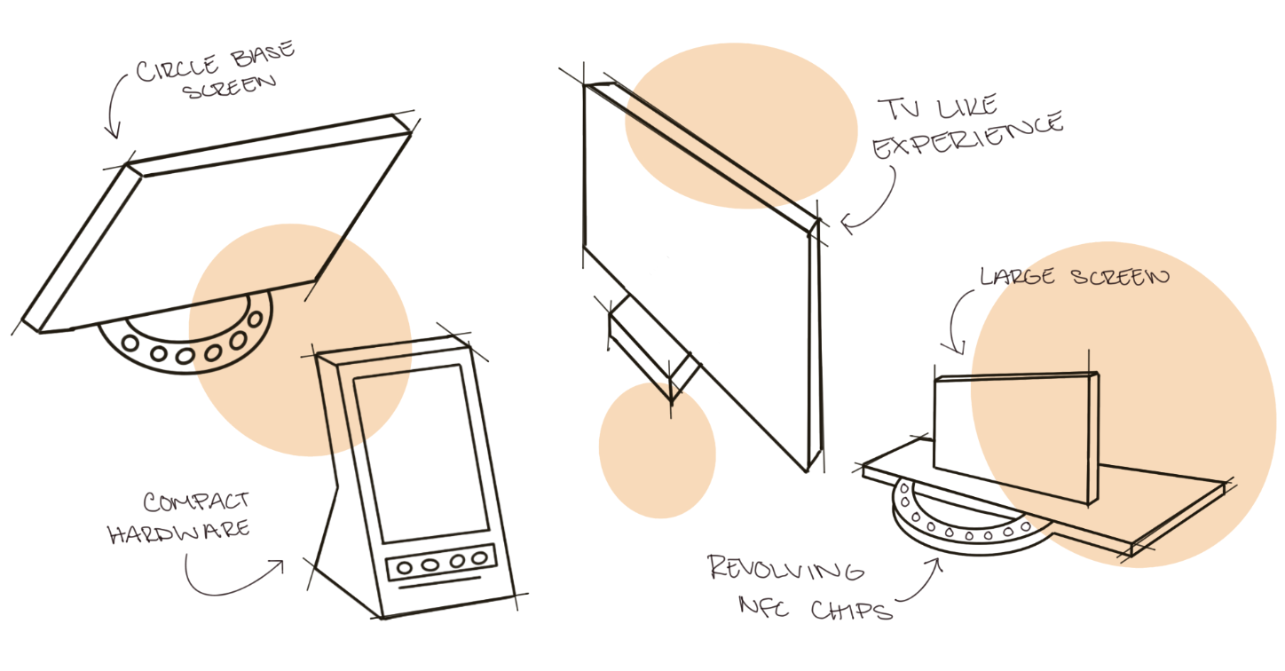
My team and I brainstormed a few variations for the hardware design. Some designs had a more tv-like experience for familiarity, a more compact design for simplicity, and a large screen for readability.
From these concepts, we settled on the top left option because it minimized surface area which made for a more simple navigation for our NFC idea and it was a sleek design with minimal waste to the environment.
Russel's Storyboard
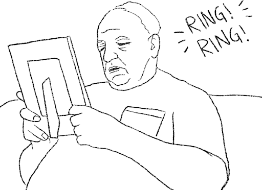
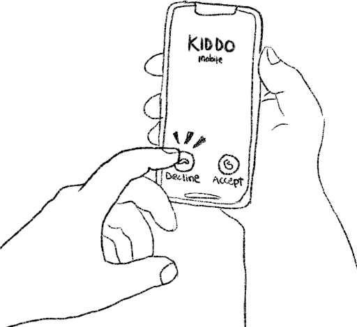
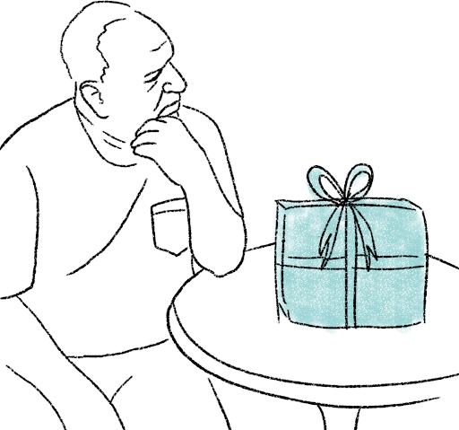
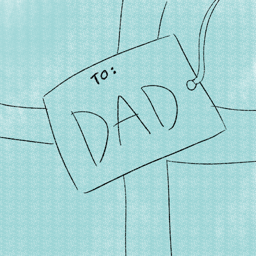
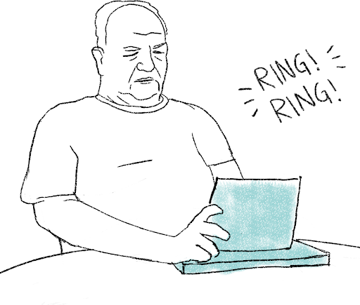
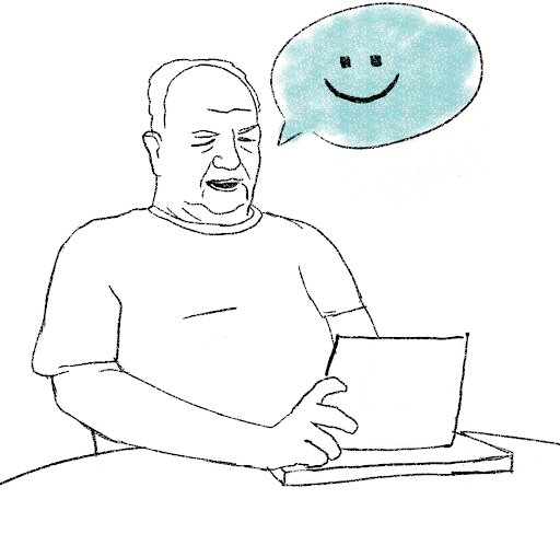
This storyboard goes through the motions of Russell's daily life and poor habits before receiving our device. He struggled with poor eating habits, drinking, and isolation as a result of these habits. After receiving our device as a gift from his daughter, he began working on establishing healthier habits and eventually was at a place where he was ready to answer the call from his daughter.
Concept refinement
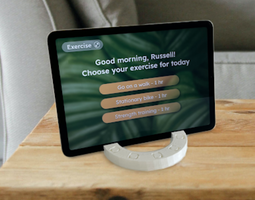
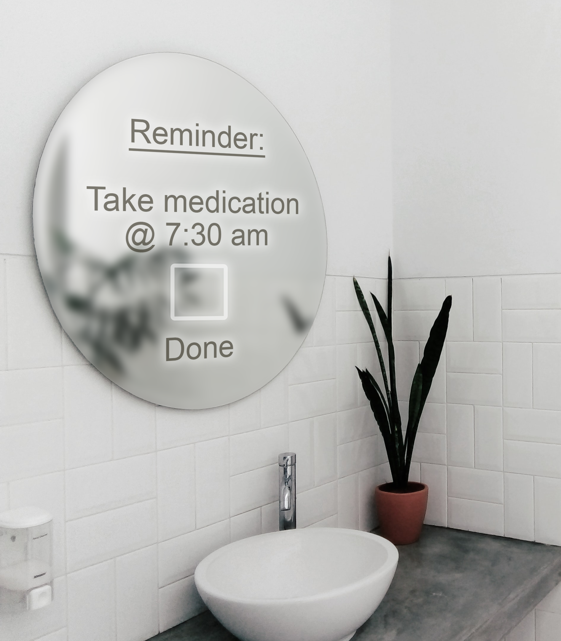
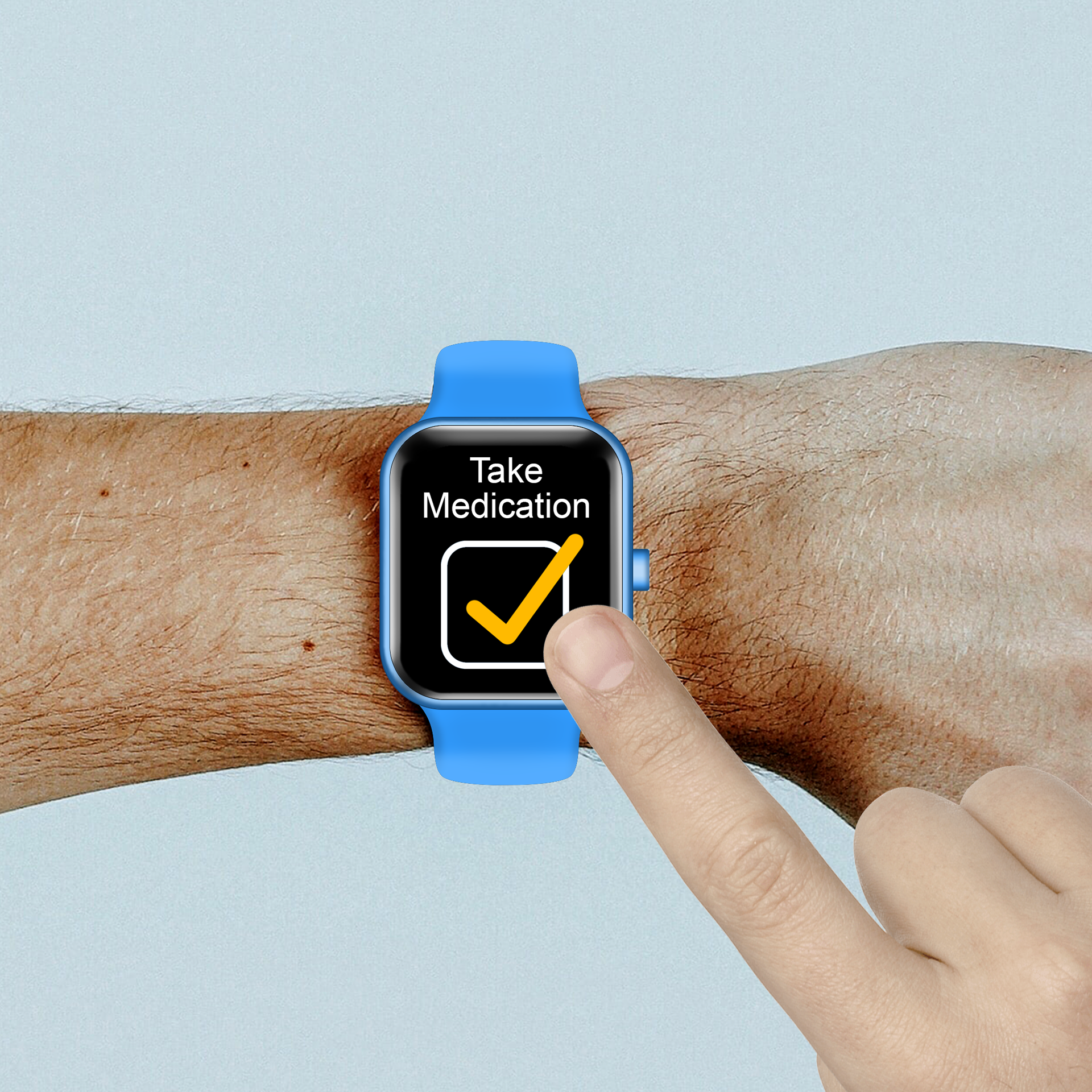
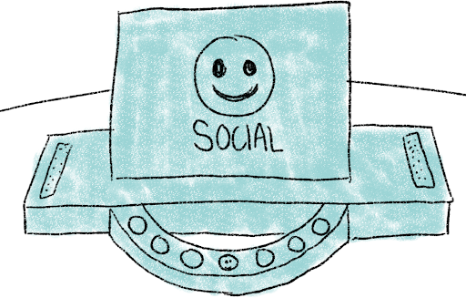
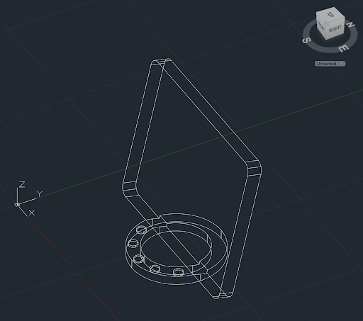
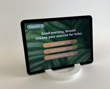
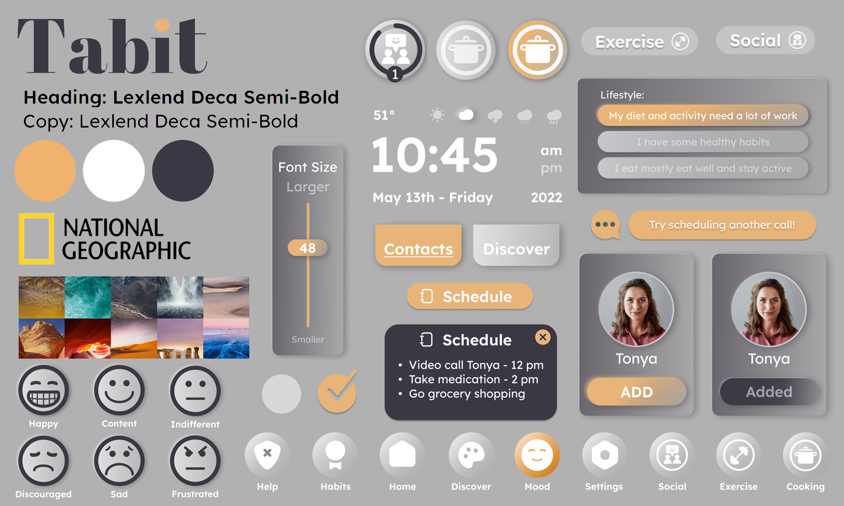
We sketched front, top, and side views of our device and then 3D printed the prototype. Here I created the name for the device; Tabit. The device's screen is similar to that of a tablet device, and our main goal is to create healthier habits for the Boomer generation. Tablet + Habit = Tabit!
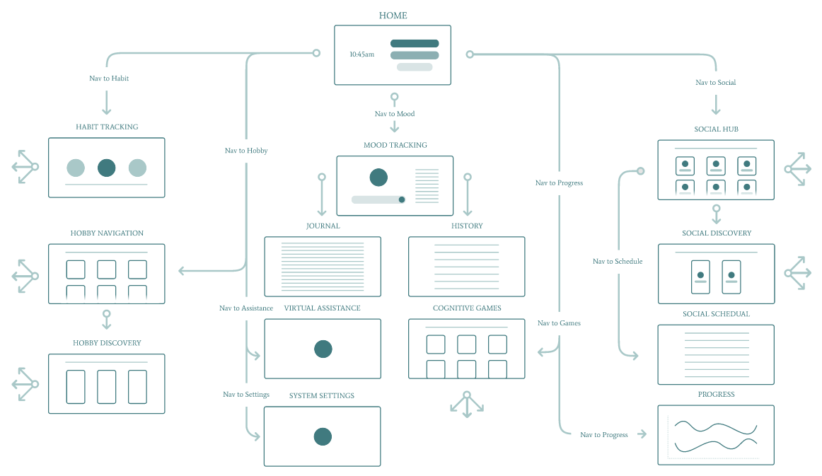
User Flow
weekly Prototype progression
Before our final prototype was complete, we asked the people we interviewed at the beginning of the quarter to do user testing. We did this by having the user click through our Figma prototype on an iPad to simulate the screen size. One part that we had trouble simulating for users was the physical rotary navigation which we instead displayed at the bottom of the Figma file.
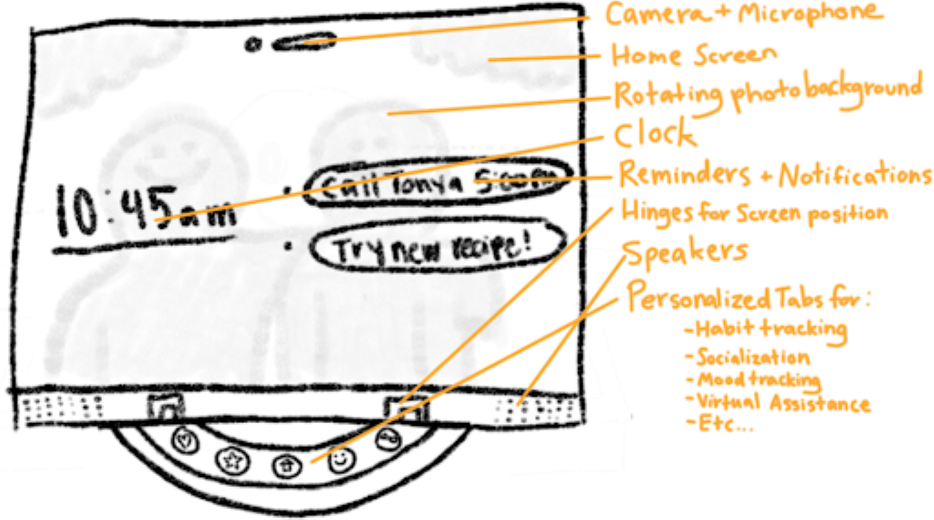
HomePage
Homepage first draft
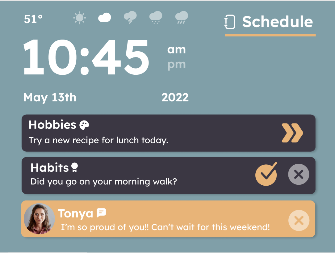
Homepage second draft
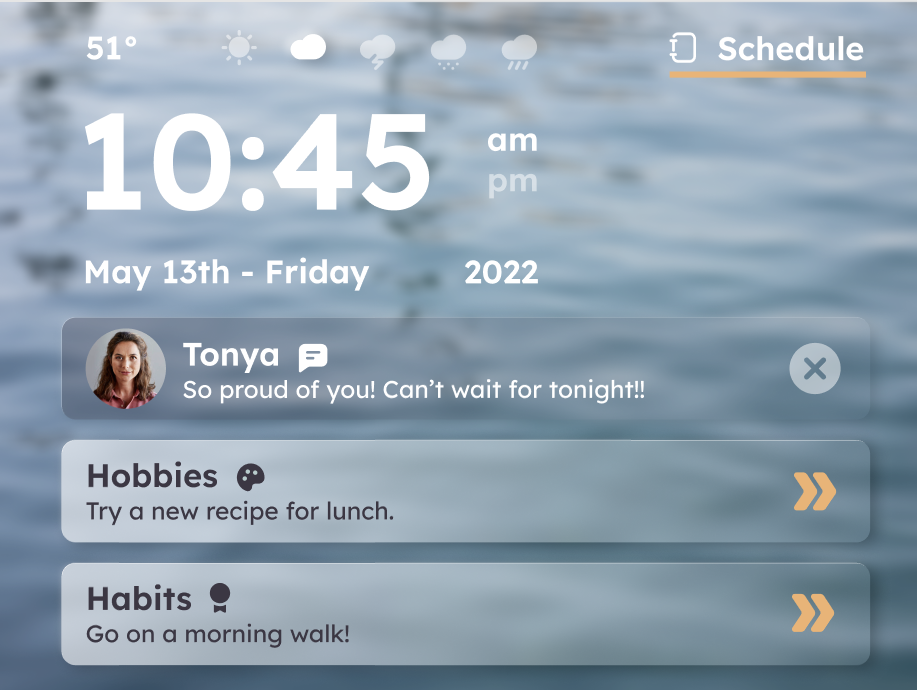
Homepage third draft
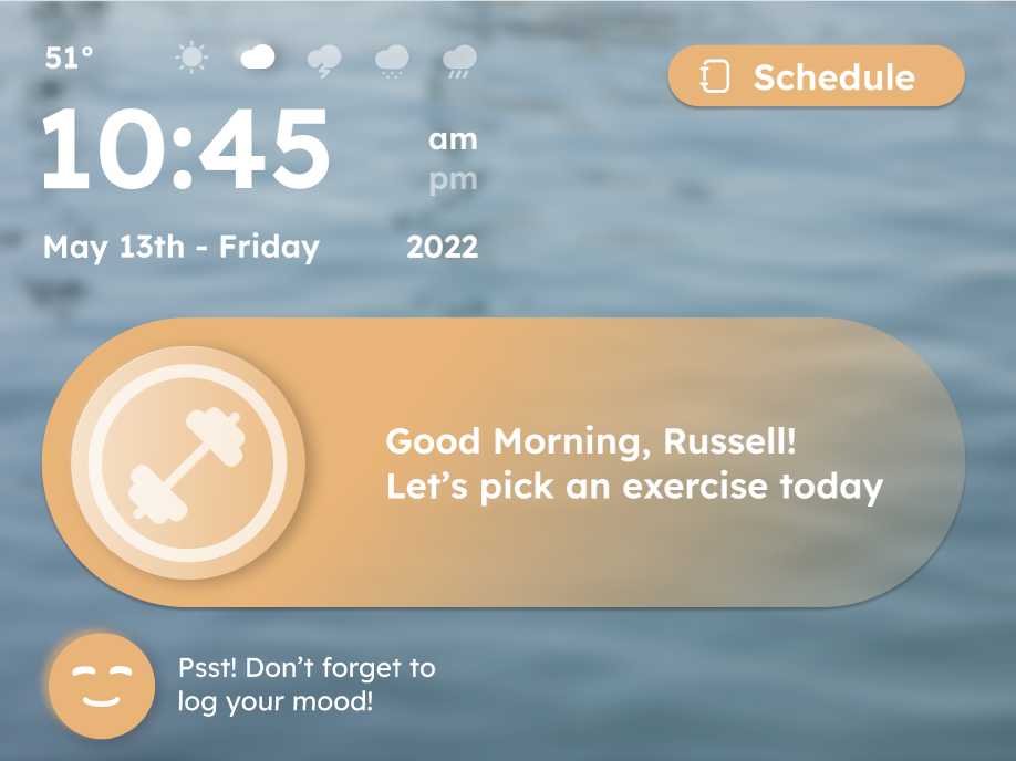
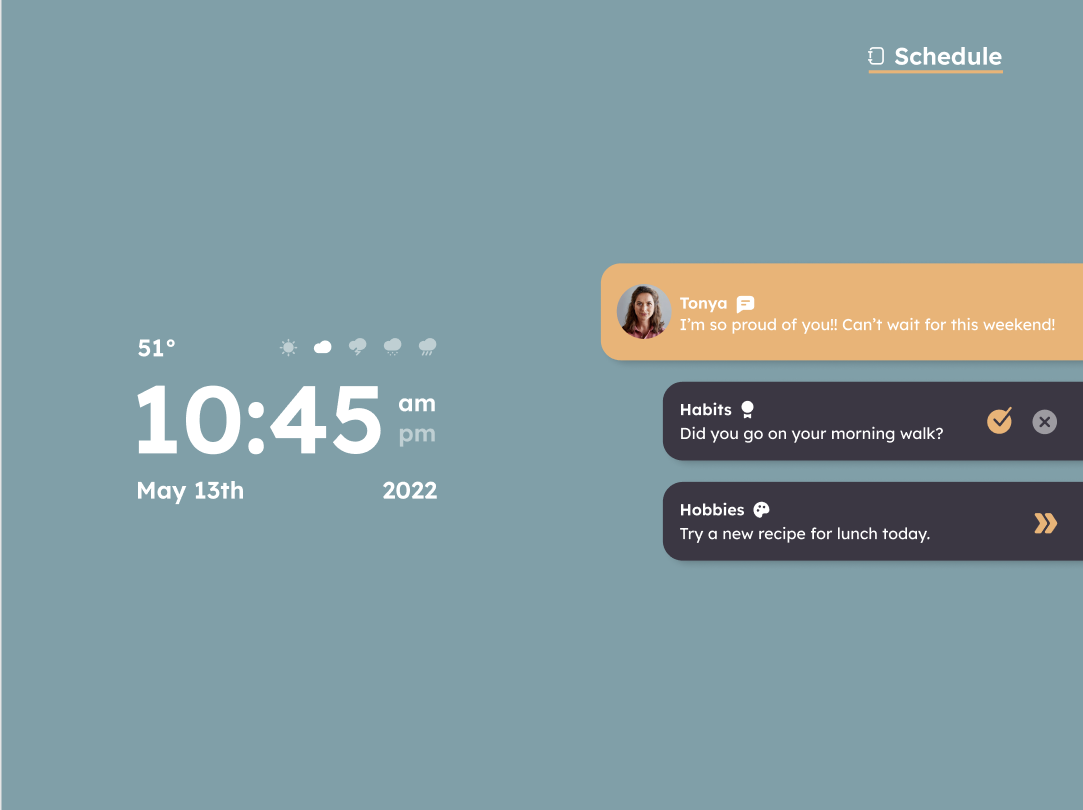
Final homepage design
We started off our lo-fi prototype with a simple color scheme and a space for a schedule, notifications, clock, and weather. Over time, the color scheme changed to background images of nature for a calming effect. Next, we took away the listed notifications to ensure the user wouldn't become overwhelmed, and instead made one big notification rotate through with encouraging prompting. Then, added a place to log the user's mood so that it is always kept track of for mental health progress.
Progress Page
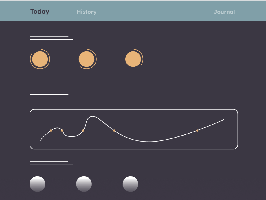
First progress page draft
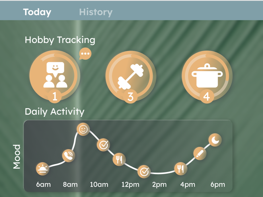
Second progress page draft
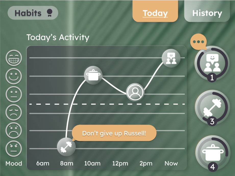
Final progress page design
Initially we started out with the idea to gamify habit tracking, similar to Duolingo. Each habit that the user chooses to work on has levels of completion. If a habit or task is neglected, the system takes that information and suggests a different way to make progress. In order to show mental health progress, we were able to graph a user's mood after completing a task. In an effort to convey a more understandable page to the user, visual changes were made in the graphing and affirmative and encouraging features were added.
Visual Design
RefLection
At the end of the assignment, we were most proud of accomplishing visual and physical design accessibility for the Boomer generation, and a mental health solution that works for the user. In retrospect, more device prompting and encouragement for a more humanitarian design, and more accurate user testing for the physical aspects of the device would have been beneficial.
Had more time been allotted, the following would have implemented:
- More accessibility features in the settings
- Intelligent emergency calls
- Memory and cognition games
- More options for interests page:
- health risks
- food allergies
- suggested goal weight
- personal palate for food preferences
Final design
This video displays Tabit's process; one can select interests, anywhere from exercising to art, and Tabit will suggest different activities based on specific mental and physical limitations. Tabit's goal is to improve mental well-being by encouraging the user to do different activities based on personal interests, or discovering new ones. This is performed by emotional feedback upon completion of their tasks, and inspires them to keep their minds and bodies active.